discovering business and user needs

PROJECT CHALLENGES
How can we optimize the purchase journey to increase checkout completion?
PROJECT GOALS
Consistency
The existing flow utilized styles, spacing, and typography systems that were inconsistent with the rest of the platform. 23andMe Customers need a seamless experience to build trust with the platform.
Transparency
23andMe customers had questions about price breakdown due to confusing language and bespoke components. 23andMe Customers need to trust the platform they submit their payment details to.
design challenge
negotiating timelines to free a product development bottleneck

CHALLENGE
At the start of the project, I was asked not to make visual changes due to ENG timelines. I pushed back on this limitation after recognizing that a cart/checkout bespoke design system contributed to slower build times and additional stakehodler approvals.
SOLUTION
I met with the design system team to discuss tradeoffs between timeline and build efficiency (2-5 days of development, expected 30% build time freed). I then met with marketing/product stakeholders to propose migrating ownership to product—requring fewer review cycles. I propposed my findings to my core PM, then the Director of Product, who approved of my design solutions in exchange for 1 extra week of build time.
proposing my solutions
After aligning with the lead PM on the payment-related requirements, I began to consider how I could elevate the experience as a whole by identifying low-effort solutions that could drive impact.

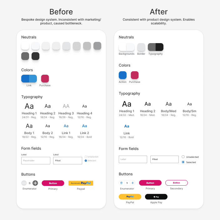
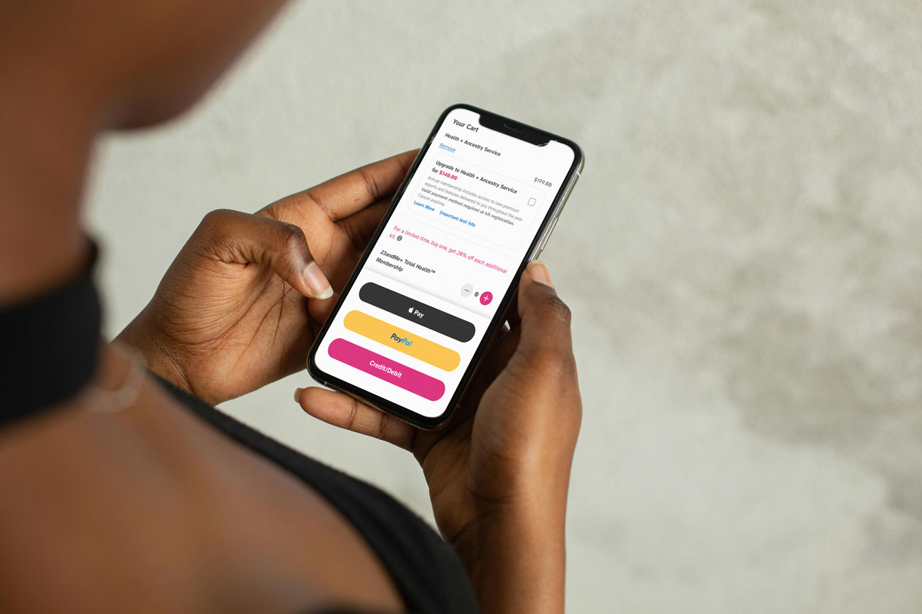
After discovering that the cart and checkout experience utilized a bespoke design system, owned by Marketing and Product, I proposed shifting ownership to the Product team. Rebuilt cart and checkout using 23andMe's product design system (Growth) and grids to ensure visual consistency with the rest of the product, reduce design/eng effort, and allow for more long-term creative solutions.
Rebuilt components to streamline product development
Worked with UX writers to clarify in-product instructions, legal disclaimers, errors, warnings and remove redundant content. Simplified completed cart sections to reduce vertical space and increase scannability of the interface.
Simplified content and reduced vertical space to drive conversion
Reorganized form layout based on research-based guidelines and competitor analysis to reduce interactions and ensure an increase in completed orders. Moved cart CTAs above the fold for quicker access.
Minimized interactions to reduce friction
Something like, this is a description
informing my design strategy

Utilized heuristic evaluation and competitive analysis to understand the existing flow, see how highly-regarded cart/checkout experiences performed, and discover technological restraints.
RESEARCH METHODS
RESEARCH GOALS
These methods were utilized to understand the technical restraints of the current experience and explore conflicts customers reported during their checkout experience.
RESEARCH RESULTS
23andme Customers experienced error-handling issues with payment methods, inability to save payment methods, required to re-enter information saved during account creation, and other bugs that contribute to a friction-inducing experience. Current cart experience contained redundant information that greatly increased vertical space, pushing CTA far below the fold.
impact and reflection
The Growth team became trapped in the cart/checkout bespoke design system, limiting A/B testing capabilities and leaving Design unable to iterate. Migrating these pages to the existing design system resulted in the core team being able to spend more time strategizing and less time building.
-30% ENG efforts for all future cart/checkout iterations
The cart's new 2-column layout and hollistic reduced interactions increased conversion by 30% over 9 months at a time when purchases were low.
+30% conversion across cart/checkout
Proposing my design solutions would largely impact the project's strategy and execution. Meeting with various specialists for information and metrics to charge my proposal provided many metrics that aided me in PM and ENG negotiations. What resulted was a new platform strategy that served the user experience, the contributors, and the business equally. Historically, design members were unable to implement similar changes to the platform so I take pride in my future-thinking solutions that empowered my entire team.
Leveraging design solutions through a shared business language
23ANDME
Cart & Checkout Redesign
OVERVIEW
Redesign of the cart and checkout experience. Negotiated a rebuild in order to implement an existing design system, opening up potential for experimental features.
ROLE
Product Design & Strategy
DURATION
2024-2025
TEAM
1 PD (Me), 1 UX Writer, 1 Director of PM, 1 PM Lead, 1 Program Manager, 1 (ENG) Team Lead, 1 Principal Engineer, 2 Front-End Engineers, and many more.
about the project
I was tasked with implementing new payment options and A/B testing CTA placement for the Cart & Checkout flow. While analyzing existing flows, I discovered key issues that contributed consumer dropoff and technical constraints that caused design/eng debt.

discovering business and user needs
PROJECT CHALLENGES
How can we optimize the purchase journey to increase checkout completion?
PROJECT GOALS
Consistency
The existing flow utilized styles, spacing, and typography systems that were inconsistent with the rest of the platform. 23andMe Customers need a seamless experience to build trust with the platform.
Transparency
23andMe customers had questions about price breakdown due to confusing language and bespoke components. 23andMe Customers need to trust the platform they submit their payment details to.
informing my design strategy
RESEARCH METHODS
Utilized heuristic evaluation and competitive analysis to understand the existing flow, see how highly-regarded cart/checkout experiences performed, and discover technological restraints.
RESEARCH GOALS
These methods were utilized to understand the technical restraints of the current experience and explore conflicts customers reported during their checkout experience.
RESEARCH RESULTS
23andme Customers experienced error-handling issues with payment methods, inability to save payment methods, required to re-enter information saved during account creation, and other bugs that contribute to a friction-inducing experience. Current cart experience contained redundant information that greatly increased vertical space, pushing CTA far below the fold.
proposing my solutions
After aligning with the lead PM on the payment-related requirements, I began to consider how I could elevate the experience as a whole by identifying low-effort solutions that could drive impact.
Something like, this is a description
Something like, this is a description
Minimized interactions to reduce friction
Reorganized form layout based on research-based guidelines and competitor analysis to reduce interactions and ensure an increase in completed orders. Moved cart CTAs above the fold for quicker access.
Rebuilt components to streamline product development
After discovering that the cart and checkout experience utilized a bespoke design system, owned by Marketing and Product, I proposed shifting ownership to the Product team. Rebuilt cart and checkout using 23andMe's product design system (Growth) and grids to ensure visual consistency with the rest of the product, reduce design/eng effort, and allow for more long-term creative solutions.
Simplified content and reduced vertical space to drive conversion
Worked with UX writers to clarify in-product instructions, legal disclaimers, errors, warnings and remove redundant content. Simplified completed cart sections to reduce vertical space and increase scannability of the interface.
design challenge
negotiating timelines to free a product development bottleneck
CHALLENGE
At the start of the project, I was asked not to make visual changes due to ENG timelines. I pushed back on this limitation after recognizing that a cart/checkout bespoke design system contributed to slower build times and additional stakehodler approvals.
SOLUTION
I met with the design system team to discuss tradeoffs between timeline and build efficiency (2-5 days of development, expected 30% build time freed). I then met with marketing/product stakeholders to propose migrating ownership to product—requring fewer review cycles. I propposed my findings to my core PM, then the Director of Product, who approved of my design solutions in exchange for 1 extra week of build time.
impact and reflection
+30% conversion across cart/checkout
The cart's new 2-column layout and hollistic reduced interactions increased conversion by 30% over 9 months at a time when purchases were low.
-30% ENG efforts for all future cart/checkout iterations
The Growth team became trapped in the cart/checkout bespoke design system, limiting A/B testing capabilities and leaving Design unable to iterate. Migrating these pages to the existing design system resulted in the core team being able to spend more time strategizing and less time building.
Leveraging design solutions through a shared business language
Proposing my design solutions would largely impact the project's strategy and execution. Meeting with various specialists for information and metrics to charge my proposal provided many metrics that aided me in PM and ENG negotiations. What resulted was a new platform strategy that served the user experience, the contributors, and the business equally. Historically, design members were unable to implement similar changes to the platform so I take pride in my future-thinking solutions that empowered my entire team.
other case studies
Redesign of the cart and checkout experience. Negotiated a rebuild in order to implement an existing design system, opening up potential for experimental features.
OVERVIEW
1 PD (Me), 1 UX Writer, 1 Director of PM, 1 PM Lead, 1 Program Manager, 1 (ENG) Team Lead, 1 Principal Engineer, 2 Front-End Engineers, and many more.
TEAM
Product Design & Strategy
ROLE
2024-2025
DURATION
Cart & Checkout Redesign
23ANDME
Redesign of the cart and checkout experience. Negotiated a rebuild in order to implement an existing design system, opening up potential for experimental features.
OVERVIEW
1 PD (Me), 1 UX Writer, 1 Director of PM, 1 PM Lead, 1 Program Manager, 1 (ENG) Team Lead, 1 Principal Engineer, 2 Front-End Engineers, and many more.
TEAM
Cart & Checkout Redesign
23ANDME
Product Design & Strategy
ROLE
2024-2025
DURATION
about the project
I was tasked with implementing new payment options and A/B testing CTA placement for the Cart & Checkout flow. While analyzing existing flows, I discovered key issues that contributed consumer dropoff and technical constraints that caused design/eng debt.
